
As we identified as a group, key level design was missing from the ‘Going Home’ GDD; such as height/depth, any overlapping areas and key visuals.
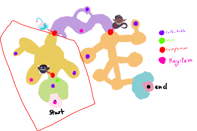
There is a small map provided in the GDD which looks like this:

It highlights exactly where the Key items are for the quests, and also shows where the companions are. It roughly gives an indication as to where the extra collectables are too, but there are no ‘Landmarks’ shown or visual references as to what might be around.
For the vertical slice we are only creating this section of the game (highlighted in red):
This means that I can expand upon what has already been created and give a more in-depth level design for us to follow when modelling the environment.
I began brainstorming some ideas using this map.
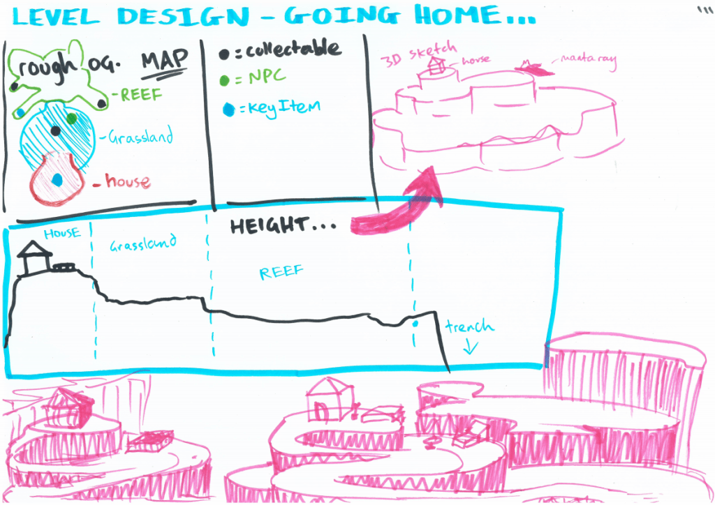
I realised from these initial sketches that I was struggling to place objects and specific interations into the level. So I began to research composition.
Composition In Level Design
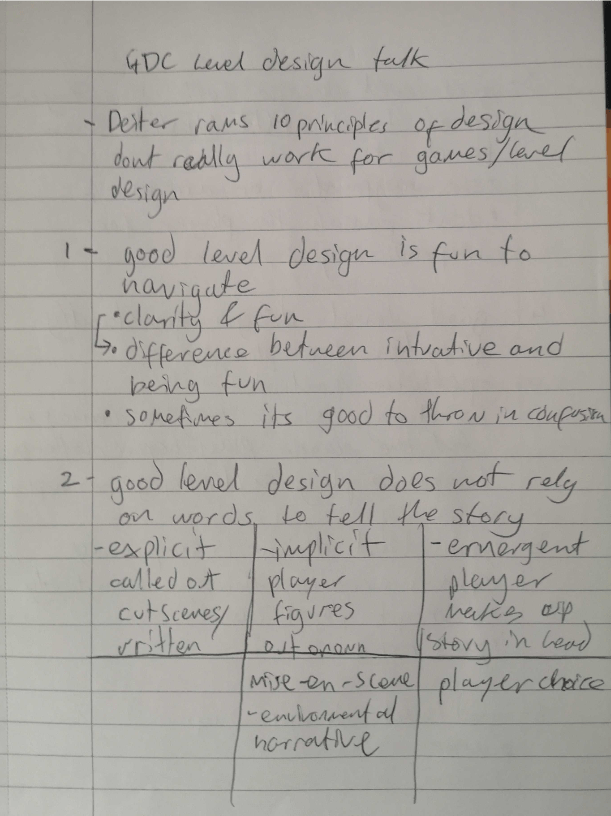
Looking into compostion for level design, I found this useful blog: http://level-design.org/?page_id=2274 that describes how composition in level design can create different visual interests for the player.
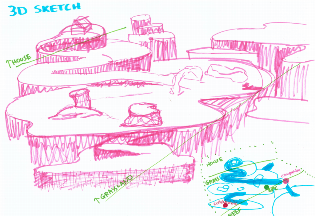
I have a particular interest in the sections that talk about making areas seem larger to the player, this is useful because Aurora, the sea slug, is small in this vast underwater world, and everything needs to appear a lot bigger than she is, while also making it easy to move around (especially in the first area; the grasslands).
Using light as a compositional element is also particularly interesting because this whole game is underwater, so creating areas where the sun shines brighter on the floor could draw the player to travel in a specific direction.
Creating visual interest in Low Poly games is sometimes tricky because of how simple the style is. This article gives some useful tips on how to create an interesting scene.
- Rotate objects, create ‘randomness’ in placement. Make it look more natural, dont use symmetry.
- Focus on shape language – what emotions do the chosen shapes convey.
- Use focal points (where the camera or player will be looking) to decide the position at which to create the composition.
- Be Dynamic – have objects of varying size and placement: some in clumps/groups and some alone.
What shapes convey specific emotions?
During this research I also read the book “100 more things every designer needs to know about people” by Susan M. Winschenk
This book really highlighted where people look based on tests and information we know about the human brain.
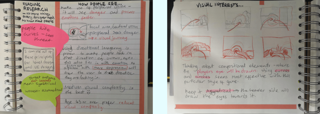
It helped me to understand that as humans we prefer curved shapes as they display less of a threat. We see danger and process emotions faster when it is seen in the peripheral vision, so compose your scene with some bolder colours or sharper edges to the side as it will provoke the need to look.
Directional imageray is proven to make people want to see in the direction it is pointing. This means using things like paths or arrows will actually guide our eyes. You can use this to your advantage to either distract or guide the user.
The book also talks about how age and gender have different statistics for design preferences. This would be especially useful information for a game with a core demographic. However Going Home is mainly for the younger/teen audience and there are not huge differences between preferences of younger generations.
Level Design Videos
I also watched quite a few talks that specifically focused on level design to understand what industry practices are used and what is generally good/bad to do to the player.
Note: lots of the points made in these talks are specific to certain types of games, however many of the tips were still applicable to Going Home.
This talk specifically outlines what players do and dont like; what can break the flow of a game. Some of the points are more specific to FPS games, however there are some key fundamentals in this talk that are really useful to know.
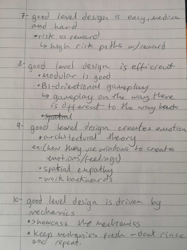
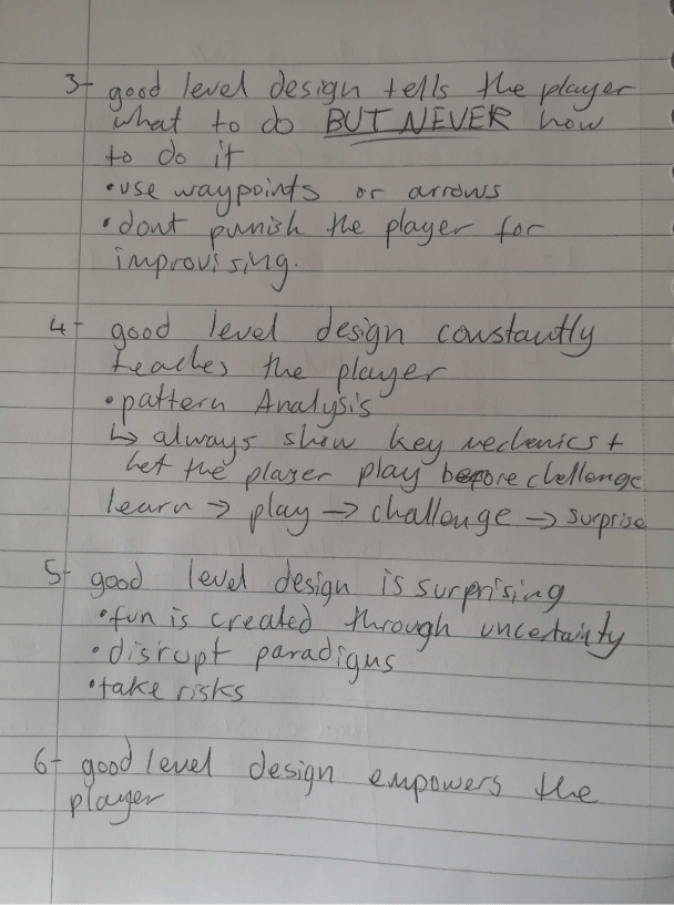
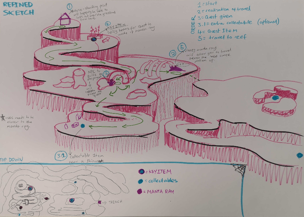
Notes from the level design talk, focusing on each of the 10 principles outlined in the video. Rule number 3 is the most important for Going Home because if we constantly guide the player then the level design will become boring, however we want the player to understand where they are and how to get to the next point in the game.
Peter Field walks through a demo greybox level that he created in Dreams and shows each element as he comes across it. This really helped me to understand how to physicalize a 2D understanding of composition into 3D space.
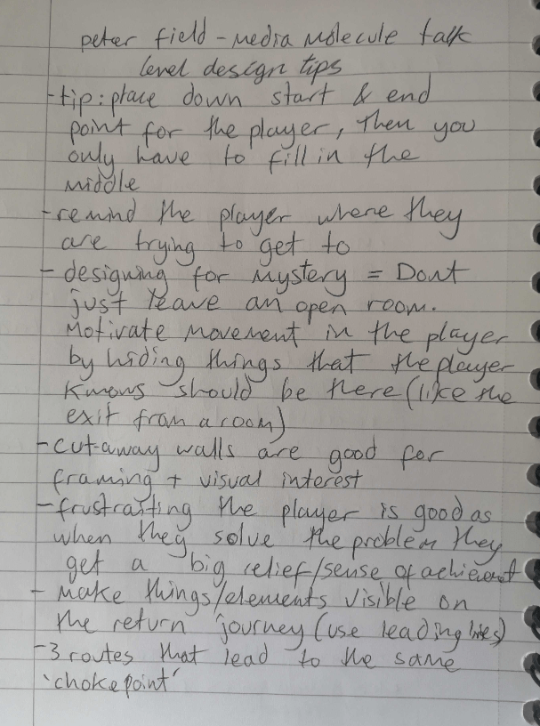
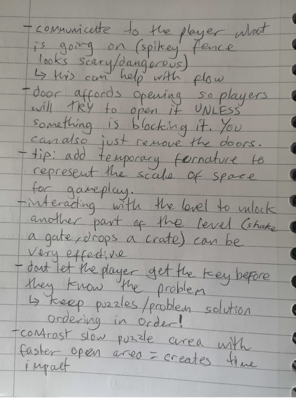
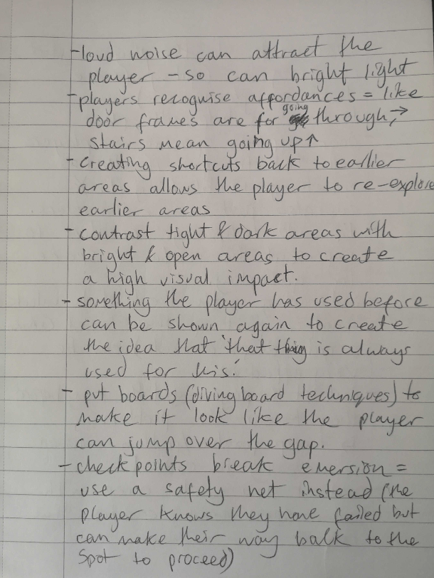
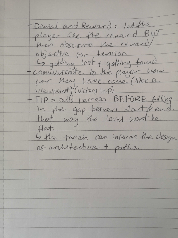
My notes on the Peter Field talk mainly highlighted good ways to create the level design and tips on how to maintain flow for the player.
A short hike was mentioned in the Going Home GDD as having a rather similar user experience, so I took a look at how the creator made their small open space work for players.
The talk really highlighted how you can never predict where every single player will go so plan for every occasion. Place objects where you dont expect the player to look because someone will look there.

One thought on “Level Design Research”