
I began by taking my original sketches from the level design research blog and re-thinking the composition. The decision was to focus on the first area (House and Grasslands) in order to create a well thought out design.
I want to give the player more visual interest so they have a reason to explore the map. Here is a brainstorm of possible assets of interest:
- Broken ship parts
- Diver helmet, goggles
- Sandstone structures
- Anchor
- Fishing hook
- Sandcastle
- Gemstones/Luminous rocks0
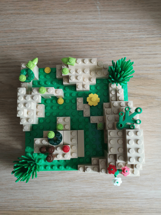
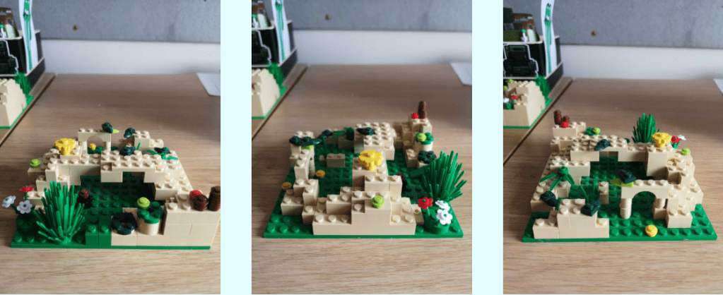
This list gave me some inspiration to create a more fluid feeling design. I built two of my favorite ideas out with Lego in order to visualise the 3D space and get a sense of scale.
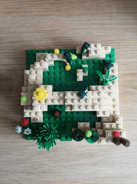
Design 1 featured an overhanging bridge type structure that means the player can navigate along the ground or overhead.
Design 2 features a cave with surrouding rocky areas, this would however create a back and forth like fluidity which could get boring for the player as they are never drawn to explore anything else on the map.
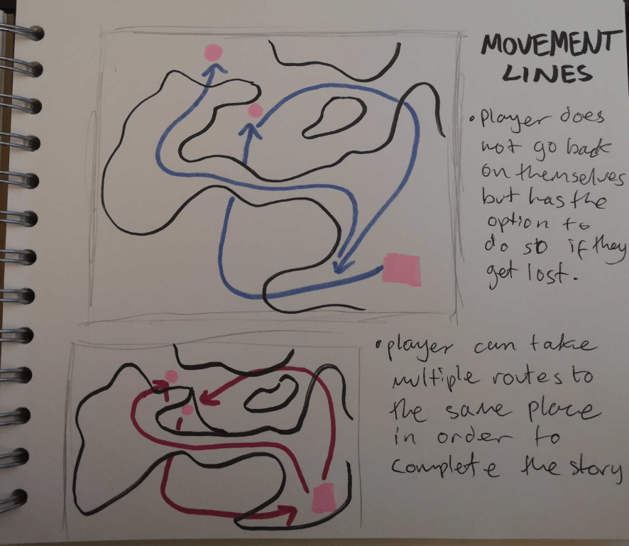
So I settled on design 1 purely for the fluidity of being able to move to specific points (marked with yellow and red studs) in multiple different ways.
I then moved onto drawing this as a top-down design with labeled markers.
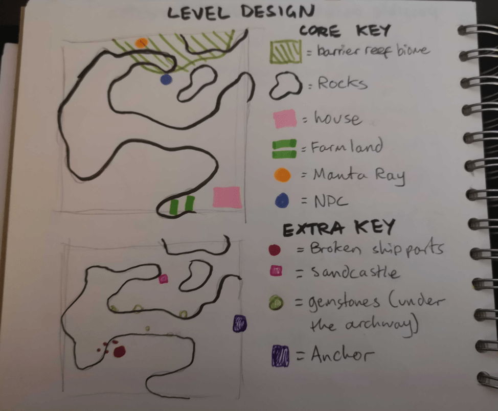
Drawing lines of fluidity also show the journey that the player may take around this particular map.
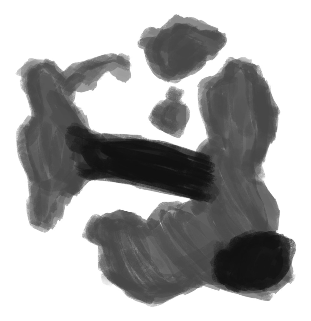
Here is a top down outline of the rocks in the map:
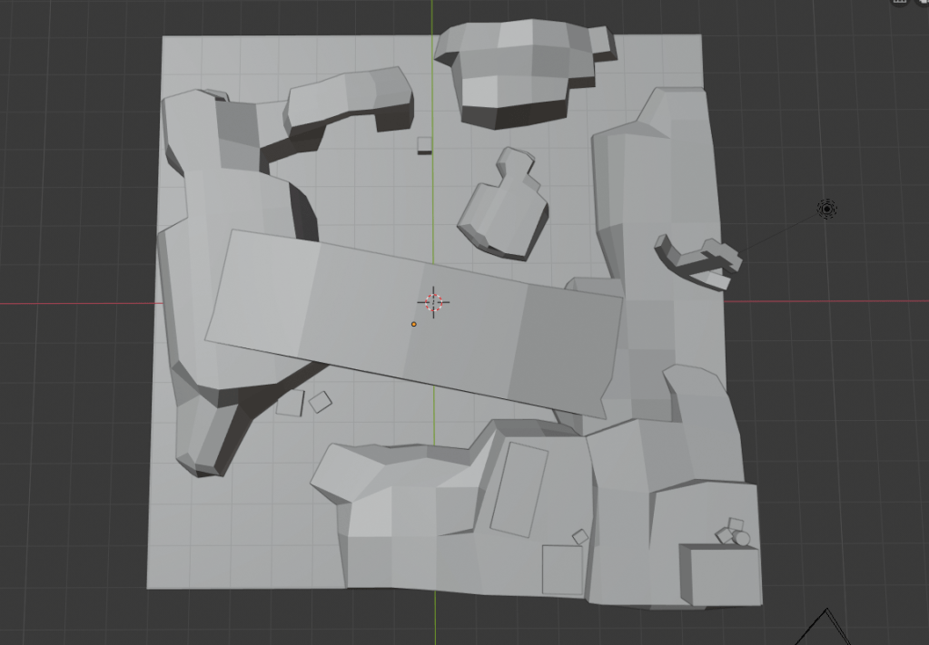
Grey box
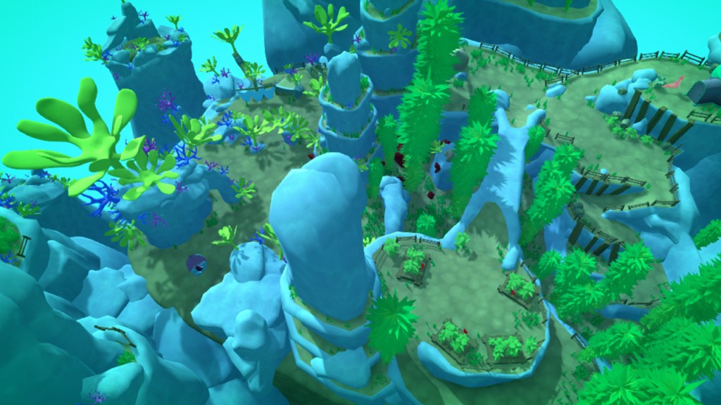
To understand the scale and interactions with the world I’m creating a greybox which can be used to test the map.
With this design we need the following assets:
- garden beds (with spicy bean plants growing inside)
- crates of beans
- barrel
- shipwrek parts
- Anchor
- sandcastle (NPC is building it)
- Gemstones (For under the archway)
The envrionment will also require assets such as:
- kelp
- coral
- grass
- smaller rocks and details
- shells
To get an understanding of the shapes and how this design could play into the environment, I’ve created a pinterest board with useful reference images.
In particular I looked at the overhanging rocks and tall cliff-like structures that appeared underwater and in many man-made fish tank scenes. These elements would help me to guide the player using composition.
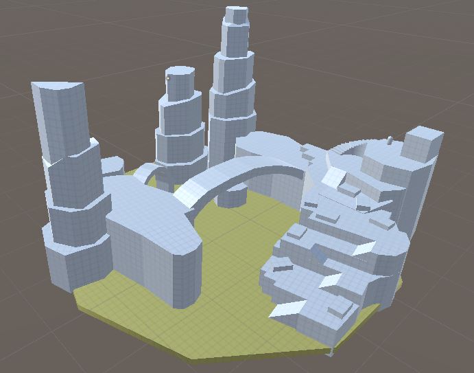
After creating the unity greybox and testing the movement I wasnt particularly happy with the farm area. I can improve this by having 3 levels instead of 4 because currently its a lot of moving up ramps to get to the top which is frustrating for the player: creating a bad user experience.
Below is a time lapse of the grey box that was created using the unity probuilder tool. The time lapse shows how after each element I would playtest with the temporary third person character controller to ensure that the player would be able to navigate the terrain while also getting a good sense of scale. It also shows how the designed evolved through playtesting.
The most helpful part about constantly playtesting while going through this process was the fact that I didn’t know quite how far away the camera would be from the player. This allowed me to test what the player could see while walking around and I ended up massively adjusting the area under the bridge to create a wider space for the camera to be able to see everything without constantly being blocked by clipping into cliffs.
While greayboxing the level I realised that the player will not have much to look at when they are at a high vantage point. This is when I introduced the tall cliffs that follow the rule of thirds and leave a gap that leads the players eye into the direction of Meryl.
The overall design allows the player to explore and gives them the freedom to go whichever way they choose while still guiding them towards the cave entrance where Meryl is sleeping.
