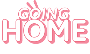
For the title screen of the game, Shannon’s GDD outlined the design for a logo. This design was hand drawn and not in a vector format so for our vertical slice I re-created the logo based upon the design in the GDD.
Looking at the hand drawn design I noticed that it was keeping in theme with the friendly “rounded” feeling of the game. Nice smooth edges fit the wholesome theme of the characters and world they live in.
I began looking at type on adobe fonts to find something nice and rounded to use for the logo.
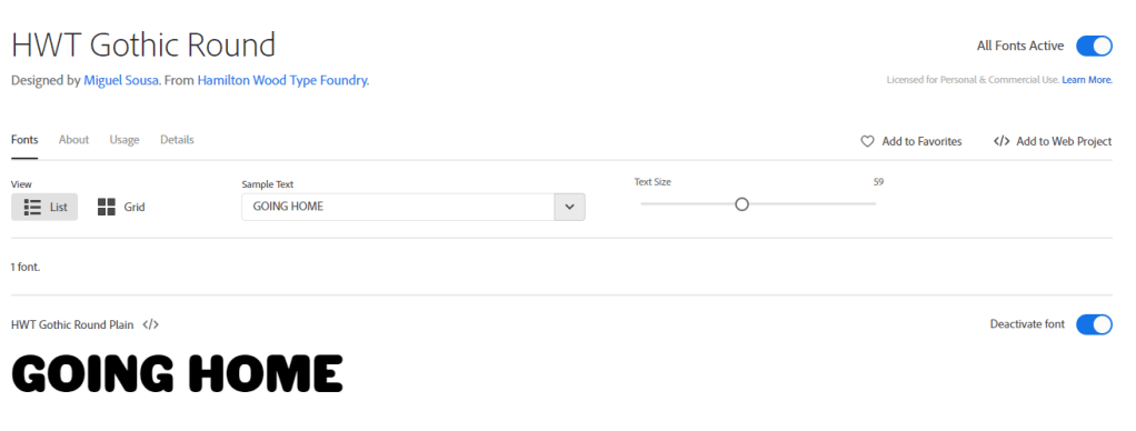
I liked the roundness of this HWT gothic round font however it was a tad too aggressive because of how bold and wide the letters are.
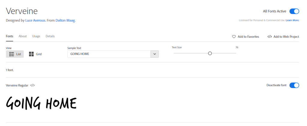
Verveine is the font I chose for the UI elements (such as the dialogue) because the hand drawn feeling matched the innocent quality of Aurora. However when thinking about using this for a logo I realised a few problems. The letters within the type itself are not all one size, this makes it hard to read on a two-line logo.
So I went to find a more rounded and in-line font.
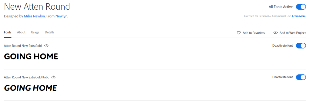
I settled upon a font named “New Atten Round”. This font had multiple options for thickness and italics, which I wanted to experiment with in the logo.
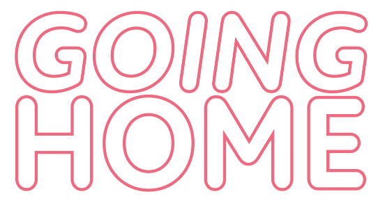
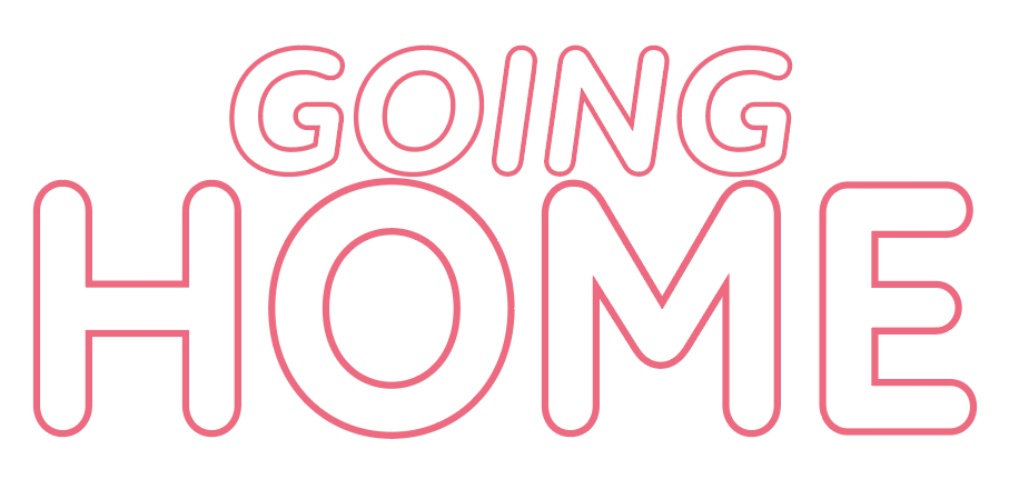
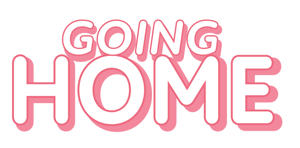
Here is a step by step of how the logo was made.
I liked the idea that the two O’s connecting made a body shape so I experimented with adding Auroras ears as they are a fairly recognisable shape.
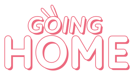
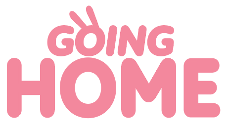
The letters in home were spaced slightly closer together so they dont look as seperate and I re-aligned the O’s to fit in a way that looked more like Aurora. I also made the ears blend with the drop shadow which is incredibly effective as its apparent that they are ears but the logo is still readable.
